To create a content template, the first thing to do, is work out what you would like as a template and customise it to fit your project. The file where these templates are stored is located in the default.xml file found here:
You can add icons to your content, using the Font Awesome plugin.
Installing the Font Awesome plugin:
Click on the 'Client Area' button, in the Ark Extensions website, homepage and select 'Downloads' from the side menu. This will take you to the 'Downloads' page, as seen below.
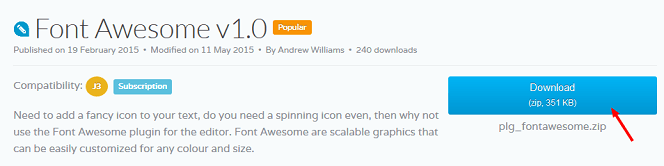
2. Click on the 'Ark Editor' button , then click on the 'Plug-ins' button. Scroll down to the Font Awesome plugin and click on the 'Download' button.
Save the 'plg_fontawesome.zip' file.
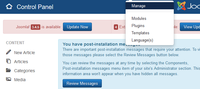
In the backend administrator, navigate to 'Extensions' and click on 'Manage'.
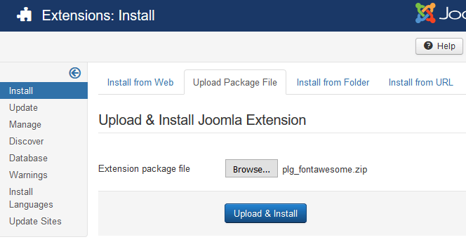
5. Under 'Upload Package File' click on 'Browse...' > navigate to the Zip file > select it and click on 'Upload File & Install'.
You will now have installed the plugin.
You now need to add, the 'Font Awesome' plugin to the editor toolbar.
To do this:
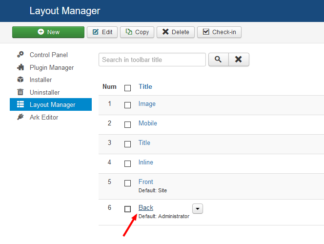
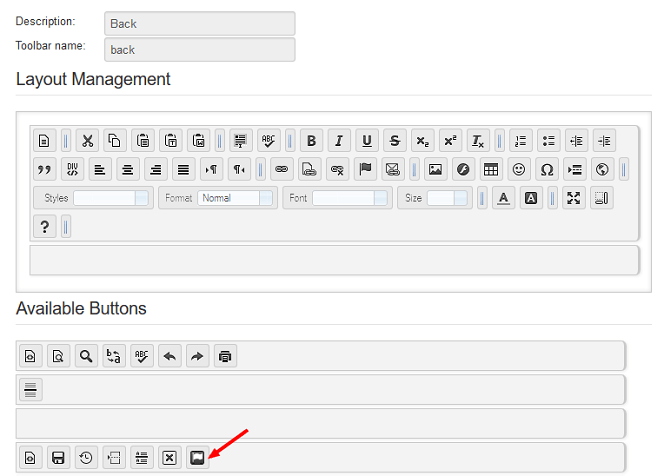
Navigate to 'Components' > 'Ark Editor' and click on 'Layout Manager'. This will take you to the 'Layout Manager' screen.
Click on 'Back', to add the plugin to the administrator toolbar. This will take you to the 'Layout Manager', backend toolbar screen.
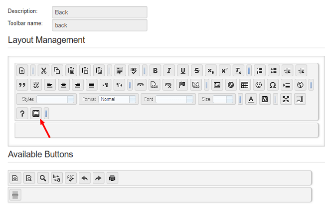
3. Drag the 'Font Awesome' button, from 'Available Buttons' to the adminstrator toolbar, above.
Finally, click on the 'Save' button. The Font Awesome plugin will now be added to the backend administrator, toolbar.
To insert icons into your content with Font awesome:
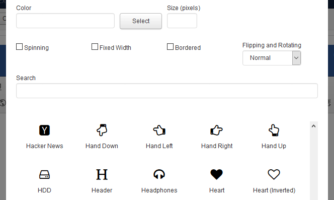
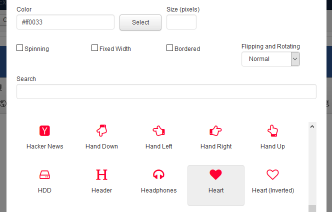
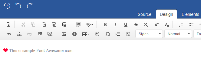
Click on the 'Font Awesome' icon. This will open up the 'Insert Font Awesome' window as seen below.
Here you can edit the icon, if you wish, by changing the colour, size, giving it a border, etc.
2. Click on the icon, you would like to insert into your content and click on the 'OK' button. The icon will now be inserted into your content.
CSS is a core technology, we use for building pages. While HTML provides the structure of your page, CSS works to provide the visual styling. Content editors are fantastic as they will do all the hard work for you but before we get on to that, lets have a quick look at how this all fits together.
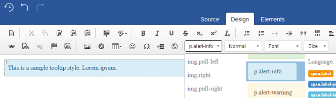
Here is an example of a (paragraph) p container, with a class applied to it.
<p class="alert-info"> This is a sample tooltip style. Lorem ipsum.</p>
Notice that the class="alert-info"has been applied to the start of the p container <p . This works by looking for a class in something we call a stylesheet. This will then reference and use the styles as defined in that class and would look something like this:
This explains how your p container should look, by defining it's background-image, background-color and other styling stuff. When rendered out in your browser, it will look like this:
This is a sample tooltip style. Lorem ipsum.
Applying styles with wysiwyg editors
The quickest and easiest way of doing this is to get the editor to do all the hard work! The editor can do this by reading from your typography stylesheet which allows you to bring your content in line with your templates look and feel. The goal is to do exactly this and bring the styles used for text editing, into the editors editing area and available at your fingertips.
To do this, start by placing your mouse on a text element, then select a style from the editor's, ‘Styles’ dropdown box.
You may want to switch to 'Elements' mode as it helps you to see where your container starts and ends.
Image rollovers can be an interesting and elegant way to navigate your users through your site. Having graphical images that come into focus on the mouse over, can also be a great way to add more flair and interaction.
This tutorial will show you a quick and easy way, to add a simple, CSS, image rollover, in two easy steps.
In the first step we will need to add two images. The first will be your button and the second should be the button hover state. This would look something like this, in your HTML code:
Which would give you this, when outputted, in the editor's WYSIWYG view.
1. Add rollover images
To do this, simply insert your two rollover images back to back, in the editing area as seen below:
2. Add image rollover style
First highlight both images, with the left mouse click as see in point (1.) below and click on the editor’s ' div ' button as seen in point (2.) which will load up the 'Create Div Container' window. Next select the: ' div.img_rollover ' style as seen in point (3.), lastly click on 'OK' and - job done!
This will wrap the images in a div container which will allow us to call the first and last image (in CSS), in creating the desired rollover effect.